A Constraint Story
Agency: Huge
Role: Motion Design Lead
Background
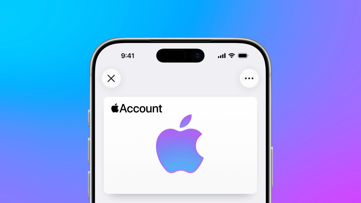
Apple was making the Apple Account more useful right inside Wallet. You could now reload your balance, add a debit or credit card, and top up in seconds, and Apple was introducing all of it through a steady run of email and web promotions. Rather than one-off sends, these formed an ongoing series that followed the whole lifecycle, from welcoming new users to guiding them through reloading and gift cards. I came on as the motion designer behind the animations that brought those promos to life, both adapting work from earlier artists and building new pieces from scratch.
Problem
Apple was rolling out Apple Account reload and Add-to-Wallet: small, unfamiliar moves customers had to learn before they'd use them. Add a card. Top up your balance. Reload right inside Wallet. A screenshot can show a screen, but it can't show a flow. Apple needed motion that made every step obvious at a glance, across email and web, without ever losing Apple's calm, clean feel.

Challenge
Two constraints were pulling against each other. The work had to be built on existing After Effects projects handed down from several prior artists, each with their own structure, timing, and style, and still read as one coherent, unmistakably Apple system. And every animation had to ship as a GIF under 2MB, so it loaded instantly in an inbox or on a page.
Either I keep the quality and the file size balloons, or compress the file and Apple's clean gradients band, its crisp UI type gets pixellated. No universal default setting worked; every clip is different, so every clip needed its own compression test to find the exact line where it stayed under 2MB and still looked like Apple made it.


Approach
I came in with a point of view of not just what each step should do, but how it should move and why. When a client tweak broke a loop, I worked out how to keep the animation seamless without losing the read, and once the entire team was aligned, I built it.
I animated in After Effects with restraint; simple, elegant movement tuned to Apple's voice and previous references, where the motion does the explaining and nothing calls attention to itself. Adapting the inherited files meant getting inside each prior artist's project, matching their easing and rhythm, and pulling everything toward one consistent look, so the suite felt authored by a single hand.
For compression, I skipped the generic web GIF makers, the quality isn't there, and built my own workflow around gifski and some scripts, tuning palette, dithering, and frame rate clip by clip until each one cleared the 2MB limit with the gradients and type fully intact. Off-the-shelf tools couldn't get there.


Results
The suite shipped across Apple's email and web promos, spanning the Apple Account lifecycle, welcome and onboarding, adding a card, reload and top-up, gift cards. It cleared Apple's review with minimal revisions, and the motion drew almost no client notes. On a brand this scrutinized, that silence is the result for me.